
The Nexiga Market Analyst online is a flexible geo-information system for the web browser and offers helpful functions for location planning and visualization of market information.
Let's take the example of a heat map: Based onselective information (addresses with additional information) that can be imported into the system, areas with high concentrations can be shown, e.g. using customer data (existing customers, new arrivals, sales) or your own locations or those of competitors.
Some like it hot? We'll show you what it's all about.
Heat maps show spatial concentration
The term heat map is associated with a kind of "temperature distribution" and is a form of representation for the visualization of data. Where do concentrations occur spatially?
Different colors, to which temperatures are usually assigned, signal the corresponding gradations via red (very hot), orange (medium hot), yellow (warm), green (cool), blue (cold).
Location intelligence or geomarketing issues often involve spatial analyses of customer distribution or sales figures. However, a heat map can also be used to analyze coverage by competitors or by the company's own branch network. Point-based information (address data) is spatially interpolated and visualized in the form of density or concentration maps. Sometimes we also speak of hot-spot analyses.
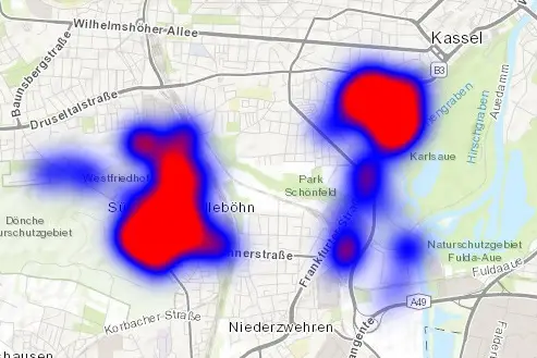
We provide an application example for the function in Nexiga Market Analyst online with the question:
In which areas is the turnover generated by my existing customers concentrated?
This requires an address list of your own customers, supplemented by a sales figure. The Nexiga Market Analyst online geocodes the addresses and displays them clearly on the map. The sales figures provided can be used to determine whether there is a spatial correlation. The heat map is created on the basis of the located customer addresses. It uses the sales figures to show spatial focuses . We describe how this works in detail in our step-by-step guide.
Results report included
It's good if you can also create something lasting from the online system. In addition to a comprehensive report in conjunction with the Determine potential function, our web tool also includes the Print function, which also generates a multi-page PDF.
You determine the display and the map section yourself, as well as the title and author (can be used for a note if necessary) and the page format and orientation. If you click on the Create button, one or more active tables (visible below the map window) can be included in the report. These appear below the map on the other pages.
The result is a multi-page PDF file(example), which can then be shared with colleagues or business partners.
However, in addition to the sales figure, other key figures such as contribution margin, frequency of visits or customer care costs can also be analyzed. Addresses of complaints or returns can also be used to identify "problem areas".
Indirectly, a white spot analysis is carried out at the same time, which shows "where there are few customers but high potential" (e.g. represented by an affinity score at zip code level or even more detailed area levels such as the Nexiga residential districts).
Would you like to find out more about the possible applications of Nexiga Market Analyst online? We regularly show these in our webinars.