Corona+ Information Gain

Significant market data in the coronavirus context

Not a day goes by without us "opening" the daily newspaper app and being confronted with infection figures, incidence values or "vaccine problems" (which we will come to in more detail with a bold forecast).


There are now numerous dashboards that accurately and reliably display corona figures at district level, e.g. that of our partner Esri, which is why we want to focus more on planning added value with the Nexiga dashboard.


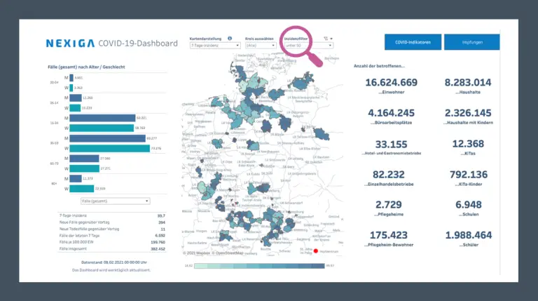
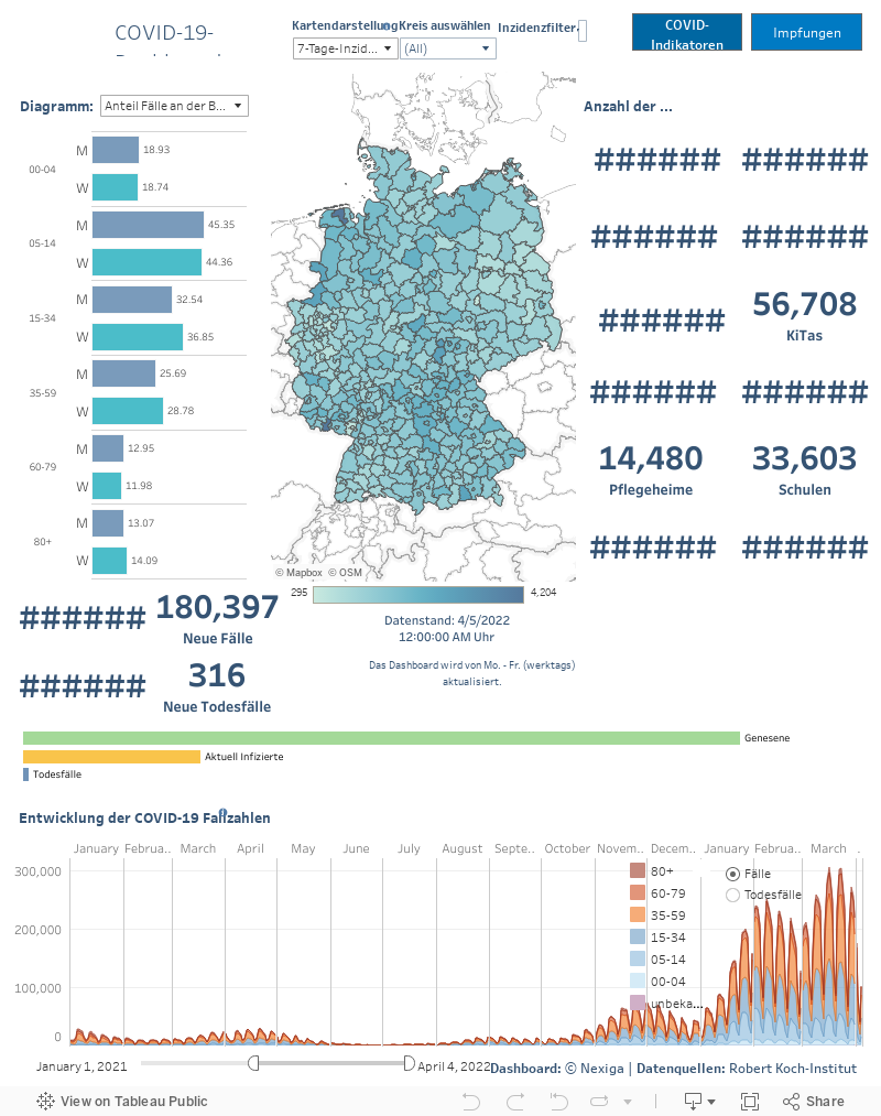
The dashboard not only provides an overview of the current infection rate, but also information that goes beyond the pure COVID-19 indicators, but is still closely linked to them. This includes information such as the total number of people affected, the number of residents, schools and pupils, daycare centers and daycare places as well as nursing homes and nursing home residents or the number of catering establishments - selected from the more than 300 features in the Nexiga database.


Get a concrete picture of the situation in your region. Find out more about the area in which the virus is spreading.

Draw your circles

The "Corona+ market data" dashboard from Nexiga shows the current development at County level (the 401 districts and independent cities) and also offers further information that is of interest in connection with the development of infections.


Take a closer look at cities and regions. Regions by incidence values, for example, can be visualized via a simple input, and vaccination forecasts can also be simulated over time.


12 additional key figures show the relevant market information related to COVID-19. Find out how your County is doing in a clear and self-explanatory way.

Dashboard Germany

Note: Due to the large amount of data that is processed directly in the dashboard - such as the more than 1.1 million individual COVID-19 data records - loading the dashboard can take a few seconds. There may also be slight delays in the display when selecting individual circles.

You are currently seeing placeholder content from Standard. To access the actual content, click on the button below. Please note that data will be passed on to third-party providers.

More information

Briefly explained using the example of Bonn

We provide data, not hypotheses.

Bonn: With just under 330,000 inhabitants, Bonn is one of the 20 largest cities in Germany. If you look at the number of infected people, currently 482 (as of today), that is 0.15% - spread across around 170,000 households. Children live in almost 48,000 of these households. Almost 13,000 children go to daycare and around 48,000 go to school. There are 2,129 businesses under severe financial pressure, 601 of which are in the catering sector and 1,528 in retail. The state must provide financial support here. In addition, 47 care homes with over 3,000 residents need special health protection.

Where the incidence is < 50...

Would you like to know where incidence values are particularly high or low?

The German government aims to reduce the coronavirus incidence rate (coronavirus infections in the past seven days per 100,000 inhabitants) to below 50. However, only just under 22 million inhabitants currently live in areas or cities with a value below 50.

Are statements about easing restrictions therefore still just wishful thinking? The figures change every day. It is therefore difficult to make a valid forecast. Questions arise: Are people here doing anything better and do the tough lockdown rules really have to apply equally to everyone in the country?

Dashboard: You can select a County on the map or select and compare the counties of a specific incidence class by simply entering the data. Specify the incidence value to be displayed (above the map view) and view, for example, the infection figures (to the left of the map) in relation to the age structure of the population living in the selected districts.

Dare to make a vague vaccination prognosis...

When will 60% of the population be vaccinated?

After a year in a "state of emergency", we are longing for our "normal" life back - without lockdown ups and downs!

Forecasting the development of vaccination rates is quite risky. The organization of vaccinations, the procurement and provision of vaccines and other uncertainties have a very strong influence on the vaccination rate nationwide and regionally.

Nevertheless, take the opportunity to predict the date on which at least 60% of the adult population will be vaccinated using our updates of the current vaccination tempo(accessible in the dashboard via the Vaccinations tab). Alternatively, you can enter your desired date for reaching this target and see how many vaccinations are needed each day.


Please note that the update is based on a snapshot of the current situation and the vaccination situation in recent weeks and can only serve as a guide to a "normal future".

NEXIGA Newsletter

Do not miss any more news and register for the NEXIGA Newsletter. Here you will be regularly informed about our software and solutions.

News